Architecture and Evolution: IV. The Position of the Viewer
Beauty is in the eye of the beholder. That is not to say, as is what this saying is mostly used for, that our aesthetic preferences differ wildly and are completely subjective. In fact, as has been shown in previous articles, there exist innate aesthetic preferences that are universal for our species.
Beauty is in the eye of the beholder, that is, it is an experience that takes place in our minds. The experience of beauty occurs when beautiful objects are observed by the human eye, which makes the position of the viewer an important consideration.
A structure is not beautiful or ugly as such. It is beautiful or ugly from a certain position. Whereas a structure can be beautiful from up close, it can be unpleasing to the eye from afar and vice versa.
The human eye is fallible. It cannot observe structures that are infinitesimally small. Nor can the mind appreciate the beauty of a building as a whole when it cannot be seen as such. A large building can be perfectly symmetrical and ornamented at its top with delightful adornments. To those who view it from up close, however, this is futile. Those viewers will only get to see a part of the building, a part which may not be symmetrical at all, nor ornamented as lavishly as its cornice and roof.
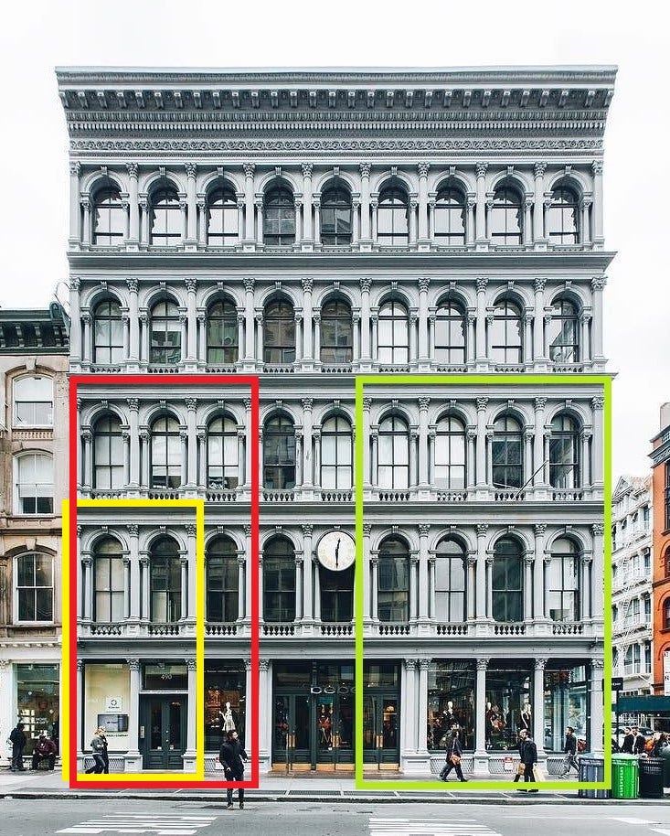
Building beautiful implies building beauty for viewers in different positions. This has important implications. Let us take a look at Figure 5.1.
Figure 5.1. A symmetrical, neoclassical building in Soho, New York City.
The different sections contain parts of the building that can be observed from different positions. Someone standing up close to the building can only see a part like that enclosed by the yellow rectangle. This view contains a symmetrical layout sectioned vertically in two. Its symmetry contributes to the viewer’s experience of beauty.
To someone positioned further away from the building, the part enclosed by the red rectangle would be visible. This part is also completely symmetrical and thereby also satisfies this vital condition for beauty.
Another person positioned even further away could see a part like the one enclosed by the green rectangle. This viewer is also exposed to an almost perfectly symmetrical view of the building. Only the ground floor section is not perfectly symmetrical. This is for practical reasons, since this building clearly needs three doors at the front to accommodate the traffic of its shoppers.
Finally, for a viewer that can behold the building as a whole, the view of the façade in its entity is also symmetrical.
This building shows how designing for beauty includes satisfying its conditions for viewers in multiple positions. The architect exposes viewers to symmetry from many distances and positions, and thereby deals with the position issue very well.
Note how satisfying the condition of bilateral symmetry and designing beauty for multiple positions together results in the horizontal repetition of the design’s parts. If this were not the case, even if a deviation to the pattern would happen on both sides of the building such that it remains symmetrical as a whole, some viewers would be exposed to an asymmetrical view.
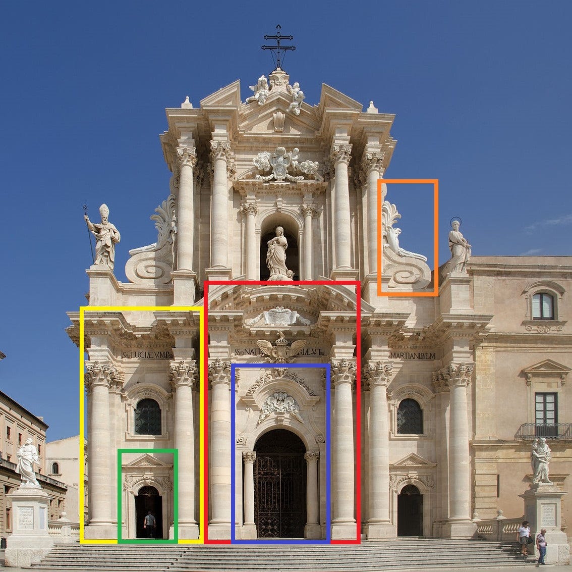
Figure 5.2 shows how, besides creating symmetry for multiple positions, applying ornament for multiple positions is also important.
Figure 5.2. The Cathedral of Syracuse, or Cattedrale metropolitana della Natività di Maria Santissima in Syracuse, Sicily. It was designed by Andrea Palma in 1725-1753.
It is easily seen how this façade appeals to viewers from different positions, horizontally as well as with respect to distance. A viewer standing close to the façade such that he is only able to see what is enclosed by the green rectangle, is exposed to a lavish, symmetrical ornament around the enclosed entrance. Of course, as the façade is highly symmetrical, this is the case for the most rightward entrance as well.
Another viewer, standing in the middle close to the façade and unable to see anything outside the blue rectangle, is also exposed to a beautifully ornamented entrance, fully symmetrical and adorned with foliage, spirals and other shapes.
When taking a few steps back, these viewers can view what is enclosed by the yellow and red rectangle respectively. These views satisfy the conditions of symmetry and ornament as well. From their new positions, they are again exposed to symmetries and ornaments that please the eye.
An implication of the problem of the viewer’s position is that when ornament can only be viewed from afar, it should be designed at a larger scale. This is because the detailing that makes small-scale ornament beautiful cannot be appreciated from large distances. For example, the consoles with which the lower cornice is adorned are not repeated in the upper cornice and tympanum. It would be a waste of resources to do so and would only confuse the viewer.
The higher up an ornament is on a façade, the larger its scale should be because it cannot be viewed from up close. This is very well illustrated by the orange rectangle in Figure 5.2, which contains a spiral and foliage designed at a large scale for the distant viewer.
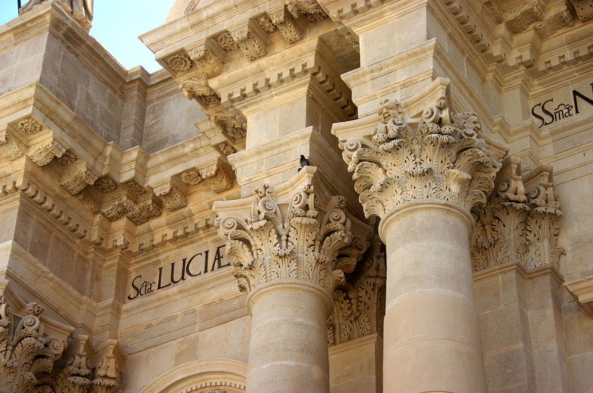
Figure 5.3. A view from below on the cornice and Corinthian capitals of the Cathedral of Syracuse. Clearly, these consoles are made for those looking at the cornice from below. They are small-scale ornaments made for the close viewer.
An architect aiming to design beautifully should do this with the viewer’s position in mind. Ideally, beauty is designed for viewers from all positions and distances with respect to the structure. Only then can the architect deliver an optimal experience of beauty.
This also implies that renderings and photos cannot convey the beauty of a design or the lack thereof well. Whereas a design may look beautiful on a picture, the experience of the viewer from positions different from the photographer’s may not be as positive. Moreover, the beauty of ornament can often not be conveyed by pictures, especially that which is built on a small scale for the proximate viewer. It is simply impossible to appreciate the immaculate detail of a building’s ornaments from an image printed on a sheet of paper much smaller than the ornaments themselves.
The same problem exists with scale models. Due to their small scale, they cannot convey the role of ornament in designs well. They provide a three-dimensional scaled-down view on the building, showing how the building would look from the sky. But perhaps we should ask ourselves: Why would this matter? How many people will, when the building stands, view it from the sky? Again, building beautiful implies designing beauty for the positions people will actually view the building from.
But there is another factor that makes pictures and renderings unsuitable for assessing the quality of design. Since our aesthetic preferences have evolved in our ancestors’ interactions with the natural environment and not with pictures, we are simply not evolved to react to an image as how we react to its object. Whereas we might find a tiger to be beautiful and imposing in a picture, we typically respond very differently when it threatens us from up close. One could interpret the aesthetic universals described in previous parts of this series as either making a building more ‘legible’ to the mind, or as ways to fool our subconscious into interpreting it as a natural object. Our preference for symmetries and patterns happens to map perfectly on the former and our preference for specific types of ornament on the latter.
If we are evolved to be averted by unnatural structures because of the potential threat that they posed in our evolutionary history, this would therefore be analogous to the example with the tiger. We are evolved to react in specific ways to objects, not images of objects.
Architecture is in many ways similar to cooking. Similar to how one cannot judge the taste of a dish by looking at its recipe, it is impossible to know whether a building will be beautiful by looking at an image of it.
Especially renderings tend to look attractive. They have the power to make us want to there. Renderings tend to depict buildings under clear blue skies or attractive lighting and surrounded by nature. But many beautifully rendered buildings tend to disappoint when seen in reality, because what subconsciously made the rendering pleasing to the eye is everything but the building itself.
For judging the architectural quality of a building, there exists no substitute for seeing the physical building itself. Architectural decisions should not be made solely on the basis of photos and renderings. Architects should design structures for those who view them, which implies taking their position into account.
Click here for the next article of this series.


